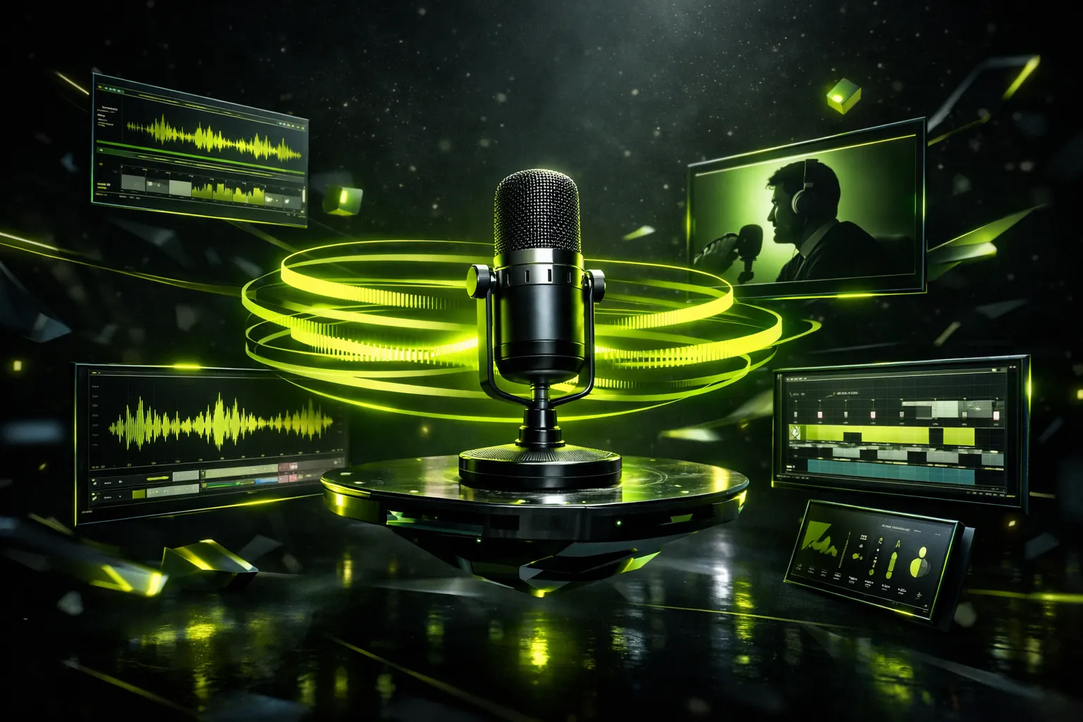
If you make a podcast and dread the whole "video" side of things, you are not alone.
You hit record, have a great conversation, export the audio, and then remember: people want video now. Clips. Reels. YouTube. Subtitles. Thumbnails. The whole circus.
That is where a simple podcast video template can save your brain.
Not a fancy After Effects project with 60 layers. Just a repeatable visual format that you plug every episode into, so you are not reinventing the wheel every week.
This is a guide to building that template, step by step, without needing to become a full-time editor.
And yes, we will talk about animated text, because that is the secret sauce a lot of high-retention podcasts are quietly using. It is also why we built Hypnotype in the first place.
What is a podcast video template, really?
Forget the word "template" for a second. Think of it like a uniform for your podcast.
Same general look. Same structure. Same rules.
You just swap in new content each episode.
A podcast video template usually covers things like:
- How your title and intro appear
- Where your logo sits
- How captions look and animate
- How your background behaves
- How you handle transitions, cuts, and key moments
Instead of making those decisions from scratch every time, you make them once. Then you reuse them forever, or at least until you get bored.
Why you actually need one (even if you think you do not)
If you are posting your podcast to YouTube, TikTok, Reels, or anywhere that has a scroll, you are competing with visuals, not just audio.
A template helps you:
- Look consistent so people recognize you fast
- Edit faster so you do not burn out
- Make more clips because the "how" is already solved
- Keep your visuals clean instead of chaotic
Most people quit on video because it feels like a fresh project every time. A template turns each episode into fill-in-the-blanks.
If you already have a podcast, think about your last three uploads. Did they look like a brand, or three unrelated experiments?
The core pieces of a strong podcast video template
Let us break this down into simple building blocks. You can use these whether you are in Premiere, Final Cut, DaVinci, CapCut, or something else.
1. The base layout
First decision: are you doing talking heads, audio-only with visuals, or a mix?
- Talking head pod: You will usually have a main camera, maybe a guest cam, and room for titles or captions.
- Audio-only pod: Think background image or subtle looping visual, waveform, and kinetic text.
Start here:
- Pick a background that you will reuse. This can be a blurred shot of your setup, a textured gradient, or a looped pattern.
- Decide where your face or main visual goes. Center, left, or right.
- Reserve space for captions so the screen does not feel crowded.
Your template should feel almost boring at first. Boring is good. It means your content stands out.
2. The intro and title moment
You have about 3 seconds to prove you are worth watching.
Build a reusable intro section in your template:
- A simple animated title of the episode or a quote hook
- A quick flash of your logo or show name
- Maybe a short kinetic typography moment where an important phrase appears in sync with your voice
You do not need a 15 second cinematic intro. In fact, that probably hurts you. Aim for 2 to 4 seconds, then get to the point.
This is where tools like Hypnotype shine a bit. You can drop in your audio, get a transcription, and build punchy word-level animations around your hook without getting lost in manual keyframes.
3. Captions that actually keep people watching
Subtitles are not optional anymore. Silent autoplay is real. People scroll with sound off. And even with sound on, text keeps the brain locked in.
For your template, lock in three decisions:
- Font and size: Clean, bold, easy to read on a phone. No tiny script fonts.
- Placement: Usually lower third, but not sitting right on the edge. Give it some breathing room.
- Style: Static captions are fine, but kinetic text often does way better for retention.
Kinetic text just means the words move and react. Think:
- The current word pops or changes color as you say it
- Important phrases grow bigger for emphasis
- Text slides in line by line, synced with your voice
The "Founders Podcast" aesthetic that everyone loves is basically smart kinetic typography: clean type, synced to the audio, with a calm background.
This is exactly the kind of thing Hypnotype is built for. It takes your podcast or essay, transcribes it with Whisper, and turns it into word-level synced animations you can drop into your template.
4. Handling the background without distracting people
If you are not careful, your background can steal attention from your words.
For a podcast video template, a good rule is:
The background should make it feel alive, not loud.
You can try:
- A subtle gradient with a bit of noise or grain
- A slow moving abstract pattern
- Soft, looping shapes in your brand colors
- A static but rich texture (concrete, paper, dark studio vibes)
As long as the text and faces sit on top clearly, you are good.
5. Visual rules for key moments
Your template should have built-in ways to make important moments feel special.
Decide ahead of time how you will signal these:
- Big idea or quote
- Chapter changes
- Emotional or funny punchline
You might:
- Scale the kinetic text up and center it
- Switch briefly to full-screen text with a strong background
- Add a quick whoosh or impact motion to the captions
- Slightly zoom in on the host during a key line
The key is that you do it the same way every time. That consistency becomes part of your "language" as a show.
Hypnotype helps here, because with word-level sync you can highlight individual words or phrases without touching the timeline frame by frame.
Building once, reusing forever
Here is how you turn all of this into an actual working template.
Step 1: Design one "hero" clip
Take a single strong moment from an episode.
Build it exactly how you wish every clip looked:
- Background set
- Layout locked
- Captions styled and animated
- Key moment treatment defined
Do not rush this. This is your blueprint.
Step 2: Turn it into a reusable project
Once your hero clip feels right, convert it into a template:
- Save the project as "PODCAST TEMPLATE" or similar
- Clear out the specific audio and text, but keep the structure
- Leave in placeholder layers: main video, captions, logo, background
Now, every new episode is just:
- Drop in new audio or video
- Drop in fresh transcription or captions
- Adjust your highlighted words or key moments
This is where Hypnotype really cuts time. Instead of manually creating animated text for each clip, you upload your audio, let it sync the words, and export the animations in your existing style.
Step 3: Create alternate versions for different platforms
You do not need a totally new design per platform. Just smart variations.
Start with:
- Horizontal (16:9) for YouTube
- Vertical (9:16) for TikTok, Reels, Shorts
Keep the same style:
- Same fonts
- Same colors
- Same caption behavior
Just rearrange the layout to fit the frame. Maybe in vertical, your face is top half, kinetic text is bottom half. In horizontal, your face is left third and text on the right.
Your viewers should instantly feel "oh yeah, this is that show" even in a 3 second clip.
Where Hypnotype fits into this workflow
We built Hypnotype because a lot of creators love the look of high-end kinetic typography, but hate actually making it.
If your podcast video template includes animated text, your usual choices are:
- Spend forever keyframing in editing software
- Pay a motion designer for each episode
- Give up and use plain subtitles
Hypnotype is our middle path.
You:
- Drop in your podcast or essay audio
- Let our transcription (powered by Whisper) do its thing
- Use a simple drag and drop editor to style your text and timing
- Get word-level synced animations, rendered in the cloud
Then you plug those animations into your template and reuse that look forever. No need to babysit render bars or worry about your laptop fans screaming.
It is basically the "kinetic typography engine" behind your podcast visuals, so you can focus on the content itself.
Start Automating Your Kinetic Typography
Don't let manual editing slow you down. Hypnotype turns your audio into engaging video essays with kinetic typography in minutes.
If you want your podcast video template to feel like a premium show without turning into a full-time editor, try running your next episode through Hypnotype and build your template around those animations.
Final thoughts: keep it simple, keep it repeatable
The best podcast video templates have three things in common:
- They are simple enough to use every week
- They look consistent enough to feel like a real brand
- They respect the content instead of distracting from it
You do not need a crazy animated universe. You just need a calm visual home for your words that people want to stay in.
Lock in your layout. Decide your caption style. Define how you highlight key moments. Then let tools like Hypnotype handle the heavy-lift of turning your audio into engaging motion.
The less time you spend wrestling with video, the more time you have for better episodes. And that is what actually grows the show.